How to underline link with different color than text?
Heads up! Currently text-decoration-color is
widely supported, so not need for tricks like described below
By CSS definition the link, or any other text in HTML element can
have text-decoration property one of following
values:
- underline
- overline
- line-through
There are more options, however as of 3rd quarter of 2018 these
have partial
support in browsers. Not to mention text-decoration-color
which would allow us to make underline with different color
than link text. So to to make it work properly on all browsers,
we need to make some workaround for underline.
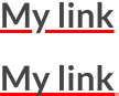
Using box-shadow
It turned out, that the best results close to the proper
text-decoration-color can be achieved with
box-shadow. The idea is tu put thin shadow without spread under
text. The results are fine, except that there are no slight
cutouts around glyph parts, which are over shadow. Also on block
elements, it will be placed under whole block, not only text:
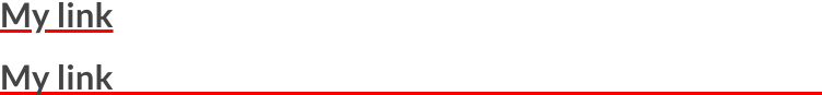
So to overcome this we need to have our links to have
display of either inline or
inline-block:
Example CSS rule:
a{
    box-shadow: 0 -0.1em 0 inset red;
}
Please note that shadow will not scale with text if value is in
pixels, that's why em unit was used, so that when
font size will change, the shadow thickness will also change.